Tutorial about simulating localization data
Locan provides methods for simulating basic localization data sets as LocData objects.
from pathlib import Path
import numpy as np
import pandas as pd

%matplotlib inline

import matplotlib.pyplot as plt
from mpl_toolkits.mplot3d import Axes3D

import locan as lc
lc.show_versions(system=False, dependencies=False, verbose=False)
Locan:
   version: 0.22.0.dev32+g4bfc3ab8b

Python:
   version: 3.11.14
Use random number generator
In all simulations we make use of numpy routines for random number generation by instantiating numpy.random.default_rng and taking a seed parameter. Therefore, we recommend to set up a random number generator in every script and pass that generator instance to all simulation functions through the seed parameter.
rng = np.random.default_rng(seed=1)
locdatas = [lc.simulate_uniform(n_samples=100, region=((0, 1000), (0, 1000)), seed=rng) for i in range(3)]
Jupyter environment detected. Enabling Open3D WebVisualizer.
[Open3D INFO] WebRTC GUI backend enabled.
[Open3D INFO] WebRTCWindowSystem: HTTP handshake server disabled.
fig, ax = plt.subplots(nrows=1, ncols=1)
for i, locdata in enumerate(locdatas):
    locdata.data.plot.scatter(x='position_x', y='position_y', color=plt.cm.tab10(i), ax=ax, label='locdata')
plt.show()
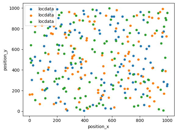
Make sure to follow the correct procedure for parallel computation as described in the numpy tutorials (https://numpy.org/doc/stable/reference/random/parallel.html).
Simulate localization data
Point coordinates are distributed on region as specified by Region instances or interval tuples.
Simulate localization data that follows a uniform distribution
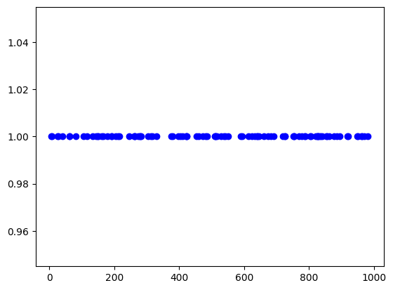
in 1d
locdata = lc.simulate_uniform(n_samples=100, region=lc.data.regions.Interval(0, 1000), seed=1)

locdata.print_summary()
identifier: "4"
comment: ""
source: SIMULATION
state: RAW
element_count: 100
frame_count: 0
creation_time {
  2026-04-30T08:38:37.365129Z
}
fig, ax = plt.subplots(nrows=1, ncols=1)
ax.plot(locdata.data.position_x, [1] * len(locdata), 'o', color='Blue', label='locdata')
plt.show()
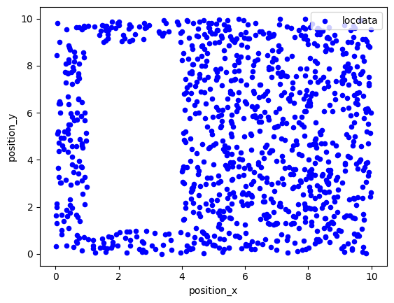
in 2d
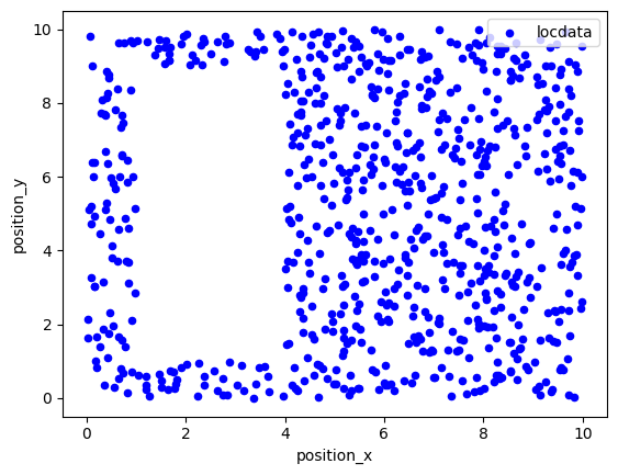
points = ((0, 0), (0, 10), (10, 10), (10, 0))
holes = [((1, 1), (1, 9), (4, 9), (4, 1))]
region = lc.data.regions.Polygon(points, holes)
locdata = lc.simulate_uniform(n_samples=1000, region=region, seed=1)

locdata.print_summary()
identifier: "5"
comment: ""
source: SIMULATION
state: RAW
element_count: 1000
frame_count: 0
creation_time {
  2026-04-30T08:38:37.460823Z
}
fig, ax = plt.subplots(nrows=1, ncols=1)
locdata.data.plot.scatter(x='position_x', y='position_y', ax=ax, color='Blue', label='locdata')
plt.show()
Simulate localization data that follows a homogeneous (Poisson) distribution
in 2d
points = ((0, 0), (0, 10), (10, 10), (10, 0))
holes = [((1, 1), (1, 9), (4, 9), (4, 1))]
region = lc.data.regions.Polygon(points, holes)
locdata = lc.simulate_Poisson(intensity=10, region=region, seed=1)

locdata.print_summary()
identifier: "6"
comment: ""
source: SIMULATION
state: RAW
element_count: 761
frame_count: 0
creation_time {
  2026-04-30T08:38:37.592506Z
}
fig, ax = plt.subplots(nrows=1, ncols=1)
locdata.data.plot.scatter(x='position_x', y='position_y', ax=ax, color='Blue', label='locdata')
plt.show()
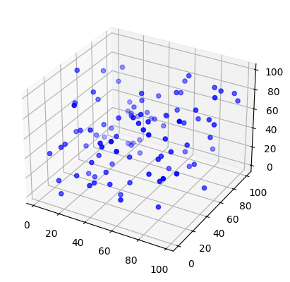
in 3d
locdata = lc.simulate_Poisson(intensity=1e-4, region=((0, 100), (0, 100), (0, 100)), seed=1)

locdata.print_summary()
identifier: "7"
comment: ""
source: SIMULATION
state: RAW
element_count: 100
frame_count: 0
creation_time {
  2026-04-30T08:38:37.687271Z
}
fig = plt.figure()
ax = fig.add_subplot(111, projection='3d')

x,y,z = locdata.coordinates.T
ax.scatter(x, y, z, color='Blue', label='locdata')
plt.show()
Neyman-Scott distribution
In a Neyman-Scott distribution parent events are homogeneously distributed with a certain region and each parent event brings about a number of offspring events distributed around the parent event. For a typical Neyman-Scott process, both the number of parent events and the number of offspring events for each cluster are Poisson distributed. It is important to note that parent events can be outside the support region. For correct simulation, the support region is expanded to distribute parent events and then clipped after offspring substitution.
Matern distribution
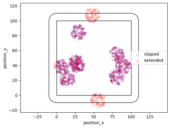
In a Matern process offspring localizations are distributed homogeneously in circles of a given radius around the parent event.
locdata = lc.simulate_Matern(parent_intensity=1e-3, region=((0, 100), (0, 100)), cluster_mu=100, radius=10, clip=True, seed=1)
locdata_expanded = lc.simulate_Matern(parent_intensity=1e-3, region=((0, 100), (0, 100)), cluster_mu=100, radius=10, clip=False, seed=1)
fig, ax = plt.subplots(nrows=1, ncols=1)
locdata.data.plot.scatter(x='position_x', y='position_y', ax=ax, color='Blue', label='clipped', alpha=0.1)
locdata_expanded.data.plot.scatter(x='position_x', y='position_y', ax=ax, color='Red', label='extended', alpha=0.1)
ax.add_patch(locdata.region.as_artist(fill=False))
ax.add_patch(locdata_expanded.region.as_artist(fill=False))
ax.axis('equal')
plt.show()
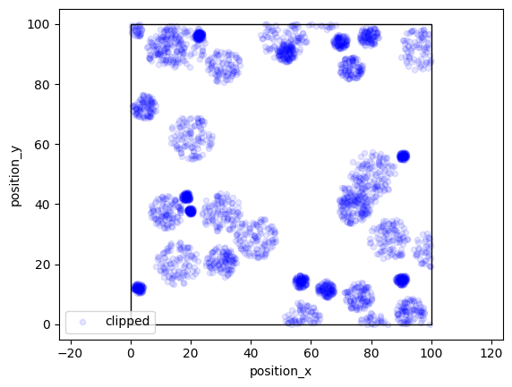
More variability can be achieved by specifying arrays for radius.
locdata = lc.simulate_Matern(parent_intensity=3e-3, region=((0, 100), (0, 100)), cluster_mu=100, radius=np.linspace(1, 30, 300), clip=True, seed=1)
fig, ax = plt.subplots(nrows=1, ncols=1)
locdata.data.plot.scatter(x='position_x', y='position_y', ax=ax, color='Blue', label='clipped', alpha=0.1)
ax.add_patch(locdata.region.as_artist(fill=False))
ax.axis('equal')
plt.show()
Thomas distribution
In a Thomas process offspring localizations follow a normal distribution with center being the parent event and a given standard deviation. Here the region is expanded by a distance that equals cluster_std * expansion_factor.
locdata = lc.simulate_Thomas(parent_intensity=1e-3, region=((0, 100), (0, 100)), cluster_mu=100, cluster_std=3, clip=True, seed=1)
locdata_expanded = lc.simulate_Thomas(parent_intensity=1e-3, region=((0, 100), (0, 100)), cluster_mu=100, cluster_std=3, clip=False, seed=1)
fig, ax = plt.subplots(nrows=1, ncols=1)
locdata.data.plot.scatter(x='position_x', y='position_y', ax=ax, color='Blue', label='clipped', alpha=0.1)
locdata_expanded.data.plot.scatter(x='position_x', y='position_y', ax=ax, color='Red', label='extended', alpha=0.1)
ax.add_patch(locdata.region.as_artist(fill=False))
ax.add_patch(locdata_expanded.region.as_artist(fill=False))
ax.axis('equal')
plt.show()
More variability can be achieved by specifying arrays of cluster_mu or cluster_std.
Cluster distribution
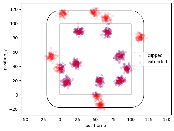
If you need a fixed number of samples, use simulate_cluster and specify arbitrary offspring distributions.
offspring_points = [((-10, -10), (0, 10), (10, -10))] * 5

locdata = lc.simulate_cluster(centers=5, region=((0, 100), (0, 100)), expansion_distance=10, offspring=offspring_points, clip=True, seed=1)
locdata_expanded = lc.simulate_cluster(centers=5, region=((0, 100), (0, 100)), expansion_distance=10, offspring=offspring_points, clip=False, seed=1)
fig, ax = plt.subplots(nrows=1, ncols=1)
locdata.data.plot.scatter(x='position_x', y='position_y', ax=ax, color='Blue', label='clipped')
locdata_expanded.data.plot.scatter(x='position_x', y='position_y', ax=ax, color='Red', label='extended')
ax.add_patch(locdata.region.as_artist(fill=False))
ax.add_patch(locdata_expanded.region.as_artist(fill=False))
ax.axis('equal')
plt.show()
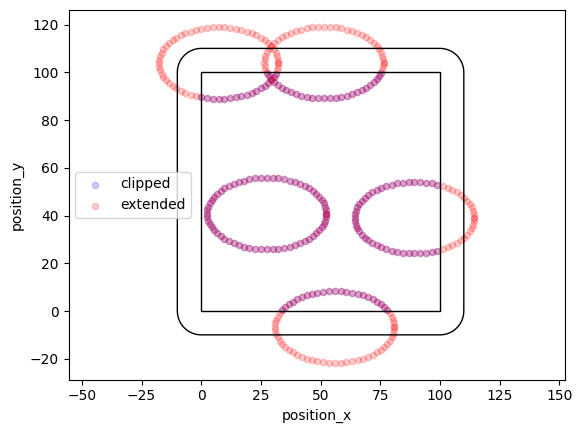
def offspring_points(parent):
    angles = np.linspace(0, 360, 36)
    for angle in angles:
        circle = lc.data.regions.Ellipse(parent, 50, 30, angle)
    return circle.points

locdata = lc.simulate_cluster(centers=5, region=((0, 100), (0, 100)), expansion_distance=10, offspring=offspring_points, clip=True, seed=1)
locdata_expanded = lc.simulate_cluster(centers=5, region=((0, 100), (0, 100)), expansion_distance=10, offspring=offspring_points, clip=False, seed=1)
/tmp/ipykernel_1702/1919565363.py:5: DeprecationWarning: This attribute is deprecated. Use vertices instead.
  return circle.points
/tmp/ipykernel_1702/1919565363.py:5: DeprecationWarning: This attribute is deprecated. Use vertices instead.
  return circle.points
fig, ax = plt.subplots(nrows=1, ncols=1)
locdata.data.plot.scatter(x='position_x', y='position_y', ax=ax, color='Blue', label='clipped', alpha=0.2)
locdata_expanded.data.plot.scatter(x='position_x', y='position_y', ax=ax, color='Red', label='extended', alpha=0.2)
ax.add_patch(locdata.region.as_artist(fill=False))
ax.add_patch(locdata_expanded.region.as_artist(fill=False))
ax.axis('equal')
plt.show()
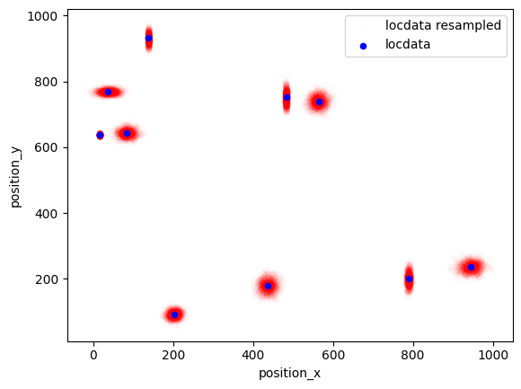
Resample data
The resample function provides additional localizations for each given localizations that are Gauss distributed around the original localizations with a standard deviation given by the uncertainty_x property.
nrg = np.random.default_rng(seed=1)
n_samples = 10
dat = lc.simulate_uniform(n_samples=n_samples, region=((0, 1000), (0, 1000)), seed=rng)
dat.dataframe = dat.dataframe.assign(uncertainty_x= 20*rng.random(n_samples))
dat.dataframe = dat.dataframe.assign(uncertainty_y= 20*rng.random(n_samples))
dat_resampled = lc.resample(dat, n_samples=1000, seed=rng)
dat_resampled.data.tail()
| original_index | position_x | position_y | uncertainty_x | uncertainty_y | |
|---|---|---|---|---|---|
| 9995 | 9 | 16.588993 | 637.384516 | 0.570128 | 2.14394 |
| 9996 | 9 | 16.321778 | 636.742488 | 0.570128 | 2.14394 |
| 9997 | 9 | 15.912710 | 637.256600 | 0.570128 | 2.14394 |
| 9998 | 9 | 15.937022 | 635.703609 | 0.570128 | 2.14394 |
| 9999 | 9 | 15.956229 | 639.563143 | 0.570128 | 2.14394 |
fig, ax = plt.subplots(nrows=1, ncols=1)
dat_resampled.data.plot.scatter(x='position_x', y='position_y', ax=ax, color='Red', label='locdata resampled', alpha=0.01)
dat.data.plot.scatter(x='position_x', y='position_y', ax=ax, color='Blue', label='locdata')
plt.show()